Setting up the Layout
Welcome to your first project! From this point on, there will be no more “Try it Yourself” boxes in the tutorial. Instead, you should follow along with everything on your own computer. You can also download the files for each project step on Github.
The lessons for this project will be a bit longer than in the previous sections, so be sure to pace yourself and take all the time you need to follow along.
Set up the Project File
The first thing we’ll do, before we start writing any project code, is to create an HTML file with places to put our HTML and CSS. To recap, here is the standard structure of an HTML file:
<!DOCTYPE html>
<html>
  <head>
    <title>My Website</title>
    <style type="text/css">
      (Your CSS goes here!)
    </style>
  </head>
  <body>
      (Your HTML content goes here!)
  </body>
</html>
The CSS for our project will go in-between the style tags in the head, and the HTML for everything displayed on the page will go in between the body tags. We also add a title tag to the head in order to display a page title in the browser tab.
Go ahead and save this in a new file with a .html extension. You can name the file anything you’d like, but the standard file name for a website’s landing page is index.html. This name is historical, and refers to how the index is the first place you’d look if you were searching for something in a book.
Code the Layout with Divs
Before we start writing any code, we should first draw what we want our basic layout to look like. For this project, we will have a header, footer, sidebar and content. We’ll place the header and footer at the top and bottom, and we’ll place the sidebar and content side-by-side in between. The sidebar will go on the left, and content on the right.
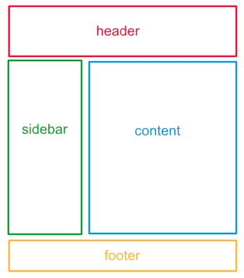
The way to translate this into code is to think of each section as its own div. To make it clear what each div is, we can give it a custom ID. So we can start our code by writing a div for each section:
<div id="header">Header</div>
<div id="sidebar">Sidebar</div>
<div id="content">Content</div>
<div id="footer">Footer</div>
Next, we think about what we need to do to arrange the divs. By default, divs are stacked one after another, vertically. However, we want the sidebar and content to be side-by-side. Remember that in the last section, we saw a way to place two divs side-by-side by putting them both inside a third div, and then setting some CSS (display: flex;) on the div they are inside of.
Let’s do this now, and give this div a descriptive ID as well - how about “container”?
<div id="header">Header</div>
<div id="container">
  <div id="sidebar">Sidebar</div>
  <div id="content">Content</div>
</div>
<div id="footer">Footer</div>
And we’ll add a CSS rule adding the flexbox rule to the container:
#container {
  display: flex;
}
Now if we load the page, we see it looks a little more like what we were expecting.

Set Custom Widths
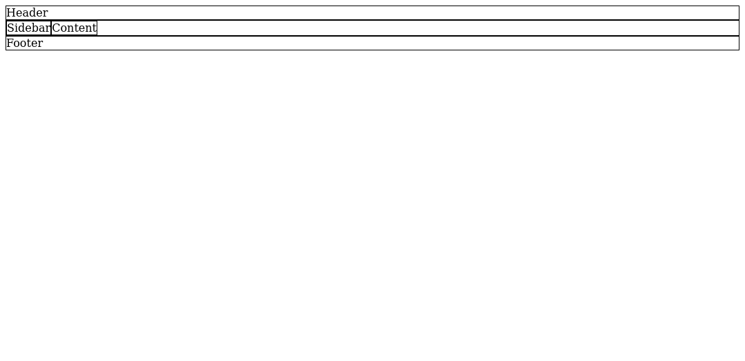
Let’s add a little CSS to help us see what we are doing. We’ll remove this later, but for now, let’s put a black border around every div so that we can see how large it is on the page. (#000000 is the hexadecimal color code for black.)
div {
  border: 1px solid #000000;
}
Now, we can see that the header and footer are taking up the full width of the page. The sidebar and content are only as wide as the text inside of them. (That is a side effect of them being inside a flex container.)
We can use the CSS width property to give them custom widths instead. Let’s just say we want the things on our page to be 800 pixels wide. To make something 800 pixels wide, we’d use width: 800px; in our CSS. width is the property, and 800px is the value. Here, px stands for pixels. It is possible to specify widths with other units, but pixels is the most common. Let’s set the width of our header, container, and footer to 800 pixels in our CSS, like so:
#container {
  display: flex;
  width: 800px;
}
#header {
  width: 800px;
}
#footer {
  width: 800px;
}
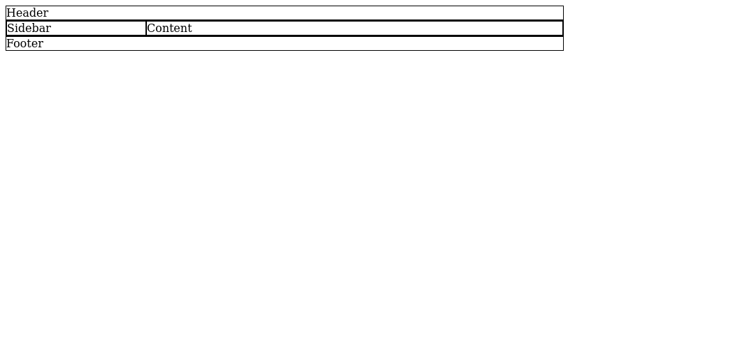
Since the sidebar and content are side-by-side inside the container, their widths would need to add to 800 pixels. Let’s make them 200 and 600 pixels, respectively. Our CSS for the sidebar and content will look like this:
#sidebar {
  width: 200px;
}
#content {
  width: 600px;
}
Now, our page looks like this:
Center Everything
This is starting to look pretty good, but everything is aligned to the left by default. It would look nicer if everything were centered instead.
If we just wanted to move everything to the right, we could accomplish that by adding a left margin. We would add it to the header, footer, and container. (If the container is moved to the right, everything inside of it will move with it.)
But how much to the right, if we want to center it? There’s no simple answer, especially since you can resize the browser to different widths, and that would change it.
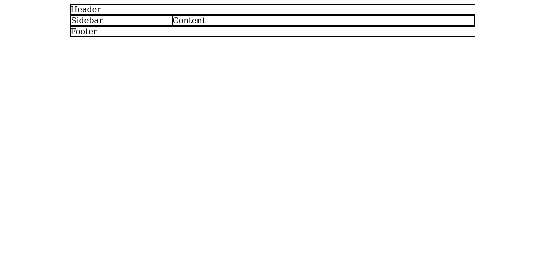
Luckily, there is a solution to this problem. Instead of giving margin-left a numeric value, you can set it to the special value auto, which means: give it as much left margin as possible. If you write margin-left: auto;, it will move everything to the right as much as it can.
The trick is that we can combine this with margin-right: auto; to move it back to the left by just the right amount. Together, these rules tell it to give the element both as much left and as much right margin as possible. Your computer compromises by making both margins equal, which causes everything to be centered on the page.
Let’s add this CSS:
#container {
  display: flex;
  width: 800px;
  margin-left: auto;
  margin-right: auto;
}
#header {
  width: 800px;
  margin-left: auto;
  margin-right: auto;
}
#footer {
  width: 800px;
  margin-left: auto;
  margin-right: auto;
}
Now, everything is centered on the page, and our basic layout is complete.
You can download the file we have so far here, and view a live example here.