Adding Placeholder Text
Now, we are ready to begin filling in the layout with some placeholder text. First, let’s add some headings to the header. In the last section, we learned that the tags h1 through h6 are used for headings. We’ll use h1 for the biggest title, and h2 for a subtitle.
<div id="header">
  <h1>My First Webpage</h1>
  <h2>My Web Development Journey Begins</h2>
</div>
Next, let’s add a few fake links to the sidebar using the a tag, which stands for “anchor” tag. Eventually, we can use these to link to more pages in our website, or other sites we like. For now, they will be placeholders so that we can style them.
Recall that, to use the a tag, we need to give it a special attribute called href. For example:
<a href="URL goes here">This text will show up as a link on the page.</a>
The href attribute is used to specify which URL the a tag links to. It’s important to set this to something in our placeholders, because links that don’t go anywhere will actually look different on the page. We want to see what links that go somewhere look like.
Since these are placeholders, one trick we can do is to set these to "#", which is a way of linking to the current page.
<div id="sidebar">
  <a href="#">Link One</a>
  <a href="#">Link Two</a>
  <a href="#">Link Three</a>
</div>
Next up is our content, which we can fill in with placeholder text. The standard text that most people use for placeholder purposes is called “Lorem Ipsum”, which is basically just a bunch of fake Latin that looks like it might be real text, but doesn’t actually mean anything. There are many Lorem Ipsum generators online, and if you want to have some fun with it, there are even themed ones online that generate text about cupcakes, zombies, bacon and more. For this example, I’ll just use the standard Lorem Ipsum Generator to generate 3 paragraphs of fake text.
However, don’t just copy it directly into your code! Recall that paragraphs have to go inside of p tags, which stands for paragraph tag. Let’s add that to our content now.
<div id="content">
  <p>Lorem ipsum dolor sit amet, consectetur adipiscing elit. Suspendisse lacinia enim ex, nec pharetra urna lacinia luctus. Morbi pellentesque odio at elit malesuada, ut fermentum erat finibus. Sed quis sapien dignissim, vestibulum nulla vel, commodo neque. Suspendisse lacinia cursus rutrum. Suspendisse et cursus ipsum, vel egestas massa. Vivamus aliquam urna molestie, accumsan nulla ut, tincidunt nulla. Suspendisse facilisis lobortis mauris at venenatis. Donec malesuada pellentesque neque non posuere. Duis rutrum venenatis nisl, ac placerat dui ultrices in. In orci leo, egestas vel eros rutrum, porttitor ullamcorper urna.</p>
  <p>Vestibulum sed enim nunc. Curabitur lectus risus, euismod vitae massa sit amet, semper imperdiet tellus. Suspendisse laoreet ut risus et scelerisque. Quisque a rutrum ipsum. Cras finibus ac nisl sit amet molestie. Proin cursus nec felis eget imperdiet. Proin sed rhoncus arcu, a viverra justo. In hac habitasse platea dictumst. Duis imperdiet, leo vel tincidunt maximus, est ipsum tempor erat, tristique vehicula tortor ligula at purus. Praesent non tincidunt massa. Interdum et malesuada fames ac ante ipsum primis in faucibus. Nullam bibendum consectetur est scelerisque eleifend. Ut pulvinar gravida nibh, ac rutrum libero efficitur sit amet. Vivamus iaculis aliquam neque, nec gravida mauris ornare id.</p>
  <p>Vivamus eu rutrum metus. Vestibulum pulvinar pretium dolor nec lobortis. Proin consequat diam nulla, id dapibus enim elementum vel. Maecenas vestibulum, metus id laoreet finibus, tellus magna euismod magna, id volutpat nisi lorem ac nisi. Vivamus semper sollicitudin lobortis. Sed nibh nisi, dapibus in rhoncus nec, ultrices non sem. Aliquam ut odio non diam facilisis molestie. Maecenas mi erat, varius at nulla ac, posuere rutrum eros. Praesent commodo risus enim, a tempus ex rhoncus eu.</p>
</div>
Finally, let’s add a small bit of text to the footer. Usually, the footer is where your copyright notice goes for the website. Since the copyright symbol is hard to type on a regular keyboard, there is a special code you can use to display it: ©
A Quick Note There are more codes like that for other symbols, all in the form of &SOMETHING;. These are called HTML entities. Two other useful ones are < and > for the less than and greater than symbols. Since < and > are used in HTML tags, the computer could get confused if you type them directly, so these special codes let you display them in your page without any ambiguity.
Let’s go ahead and add a copyright notice to the footer of the page.
<div id="footer">
© 2025 | All Rights Reserved
</div>
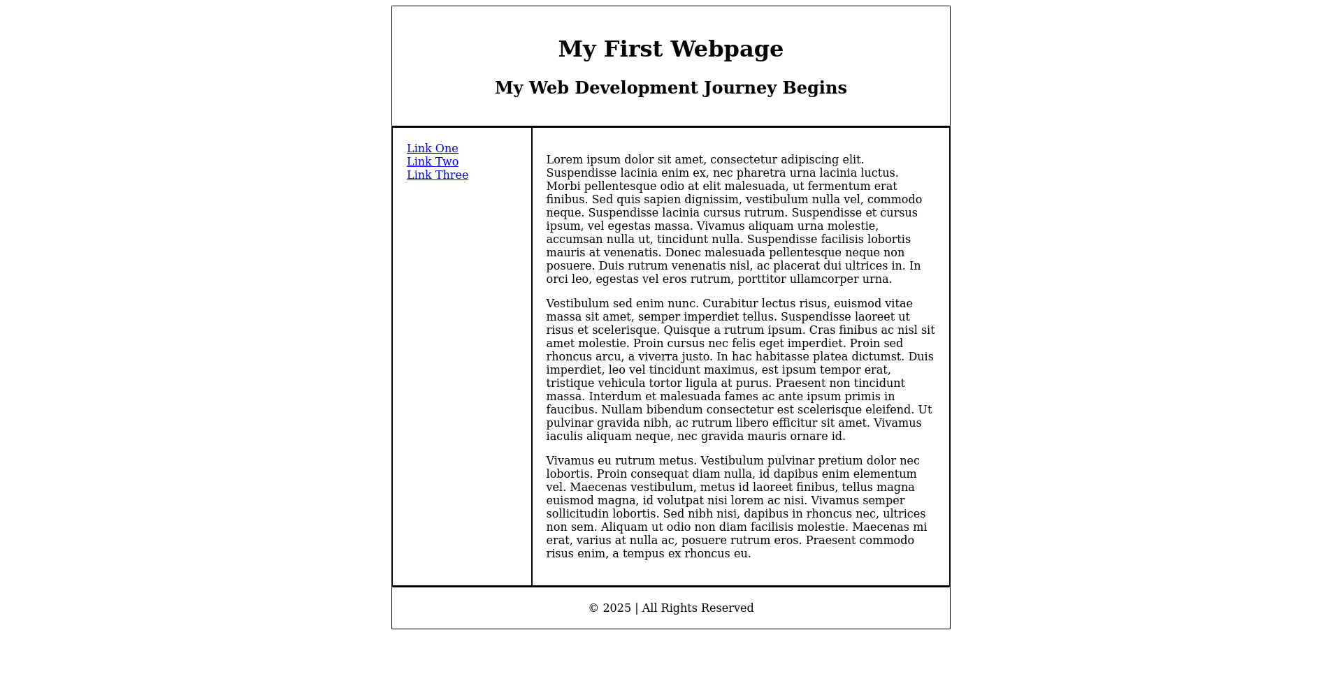
Now let’s reload our page to see what it looks like:
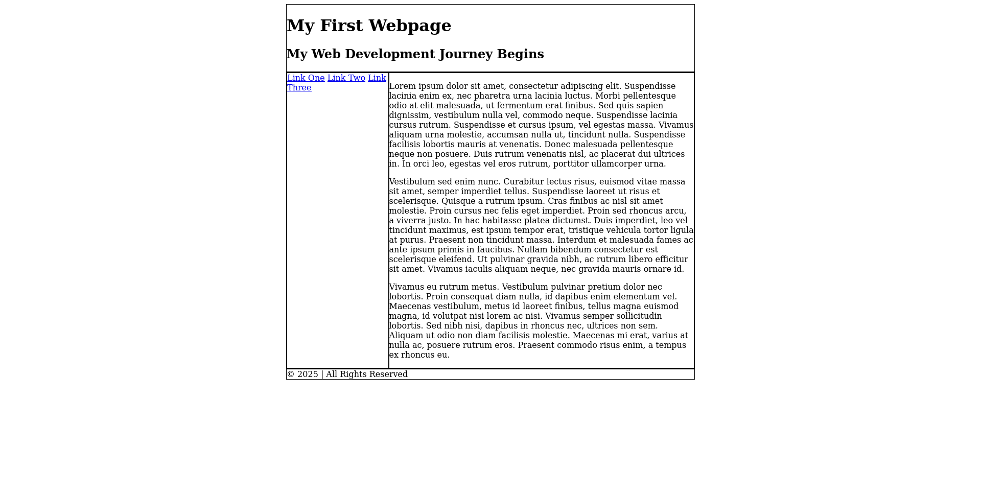
This is looking much more like a real webpage now!
Adding Some Padding
It’s time to start adding some design to this page. The first thing we’ll do is add a bit of padding to each section of the page. To recap, padding is the space between the borders and content of each div. I’ll start by adding 20 pixels of padding to the header, content, sidebar, and footer.
We could accomplish this by adding padding: 20px; to the CSS for each of the four sections. However, there is a shorter way to write this. If we want to apply the CSS to multiple elements, we can actually specify them in a comma-separated list like this:
#header, #footer, #sidebar, #content {
  padding: 20px;
}
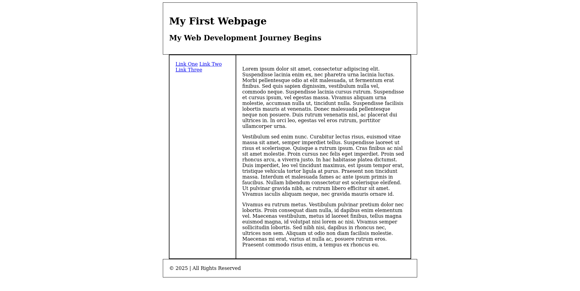
Go ahead and add that code below the rest of your CSS. Now if we reload the page, we see everything has some padding. But wait - there is a small problem. The header and footer got wider, because the padding got added to the width. (The sidebar and content stayed put since they are constrained by the #container, which we did not add padding to.)
We don’t want padding to increase the width. We want the width to stay the same, and for the padding to simply decrease the amount of width available for the content. Luckily, there is a CSS rule for this exact situation. The CSS rule box-sizing: border-box; will tell the computer to always use the width we set, and add the padding inside of that instead of in addition to that.
A funny thing about this property is that many people think this should be the default. Many web developers find it more useful to be able to specify widths and get exactly those widths, rather than having to account for padding possibly changing those widths. For that reason, it’s common to apply this box-sizing change to every element so that it is consistent throughout our project.
We can use the special selector * to specify that the CSS should apply to every single element. So let’s add this to our CSS:
* {
  box-sizing: border-box;
}
I’ll add this above our other CSS code, since it applies to everything. It keeps our code neat to be able to see universal rules first, rather than burying it in the middle somewhere.
Now our page looks how we want!
Centering the Header and Footer
Let’s add some code to center the header and footer. This can be accomplished with the text-align property, which specifies how to align text inside of your element. We will set this on the #header and #footer, to specify how their contents should be aligned.
The text-align property can have the values left, right, or center. Let’s go ahead and add text-align: center; to the header and footer:
#header {
  width: 800px;
  margin-left: auto;
  margin-right: auto;
  text-align: center;
}
#footer {
  width: 800px;
  margin-left: auto;
  margin-right: auto;
  text-align: center;
}
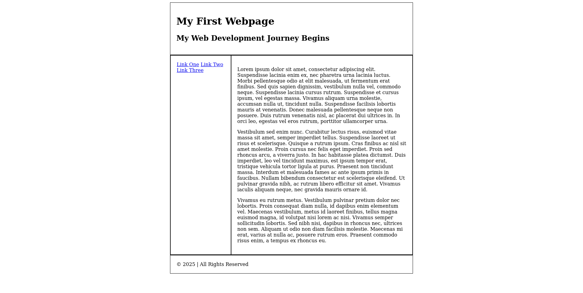
Now the header and footer are centered:
Making Links Full-Width
The last problem with our page is that our links are all on the same line, wrapping, in the sidebar. We want each link to take up its own line.
The reason the links are wrapping has to do with the CSS display property. This property controls how the element flows in the document. This property has several values, but we’ll focus on two right now:
inlinemeans that the element flows in line with the text. Texts and links are inline. These elements don’t have a fixed width - think about it, when you type a bit of text, it just takes up what it takes up. If you write multiple inline elements, they will flow in a row one after the other.blockmeans that the element gets its own section of the page. For example, a chart or figure in a document would show up on its own row. If you write multiple block elements, they will each sit on their own row, as if there are line breaks in between them.
By default, links (the a tag) are inline because they are often found in the middle of text. We can make them behave like block elements by setting display: block; on the a tag:
a {
  display: block;
}
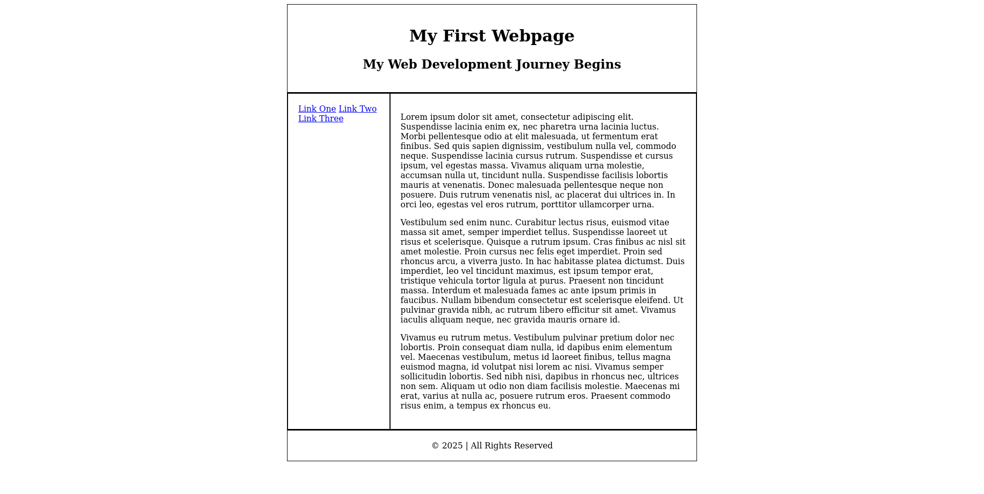
Now, our links will each take up their own row.
Selecting Only Sidebar Links
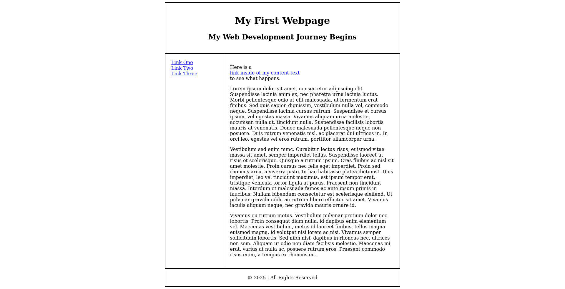
There is one problem with the code we just added: since it will apply to every a tag on the page, it will apply to links in the content as well, not just the sidebar! Let’s try adding a link to the content just to see:
<div id="content">
  <p>Here is a <a href="#">link inside of my content text</a> to see what happens.</p>
  <p>Lorem ipsum dolor sit amet, consectetur adipiscin gelit. [...and so on]
</div>
Uh oh - this doesn’t look right. The link is showing up on its own line, instead of in line with the text.
We need a way to apply our CSS to just the a tags in the sidebar, not on the entire page.
To refresh your memory: A CSS selector is the part of the CSS that we’ve been writing before the curly braces, to tell the CSS what elements to apply our rules to.
selector {
  property: value;
}
So far in this project, our selectors have been simple tags (such as div) or elements with IDs (such as #header). However, selectors can be more complex than that. CSS understands all sorts of special syntax that allows you to be more specific about what you select on the page.
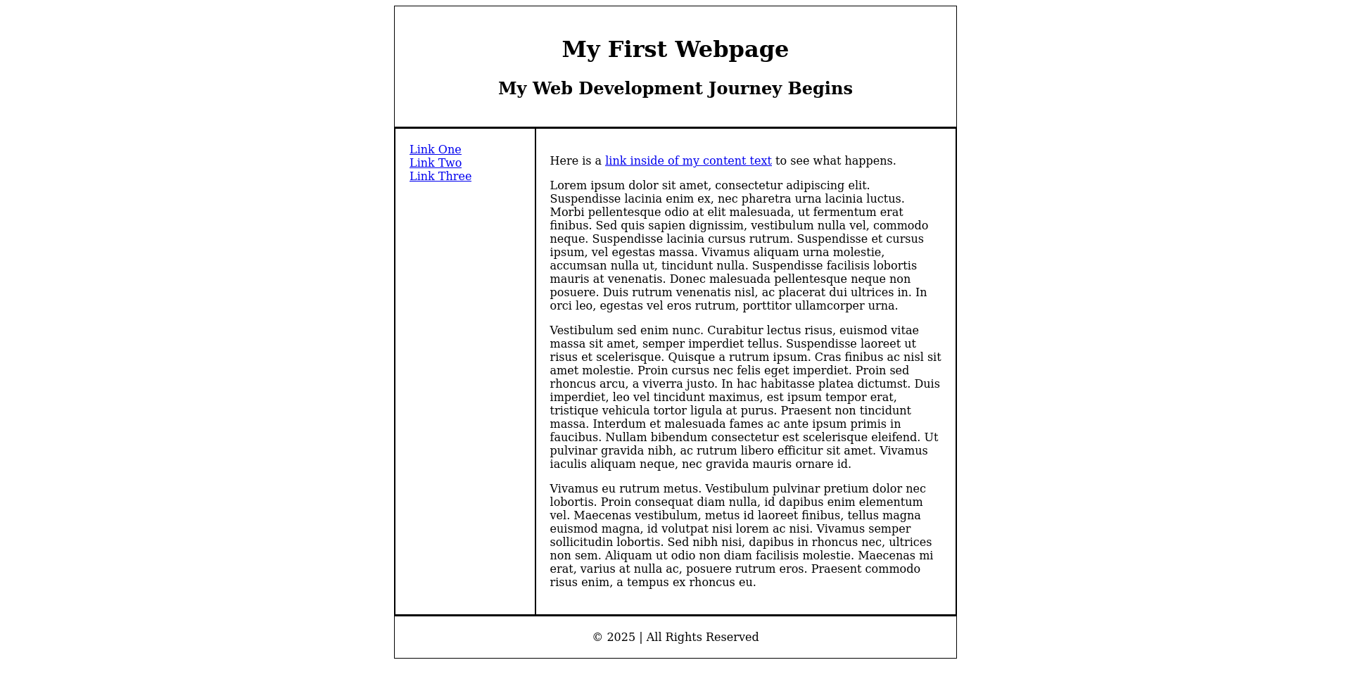
One syntax is this: #sidebar a. This selector is composed of two selectors, #sidebar and a. They have a space in between them, with no comma. When you put a space in between two selectors like this, it forms a new selector that selects all of the second thing that’s inside the first. #sidebar a means, “select every a that is inside of #sidebar”. It’s as simple as that!
Let’s modify our CSS from above:
#sidebar a {
  display: block;
}
Now our sidebar links look good, but the link inside of our content is not affected.
You can download the file for this lesson here, and view a live example here.